
← Back to work

Licious · Product, interaction & motion

Fish &
Seafood 2.0

Bringing the fish counter online.
The choice, the cut, and the confidence.

Inside the project
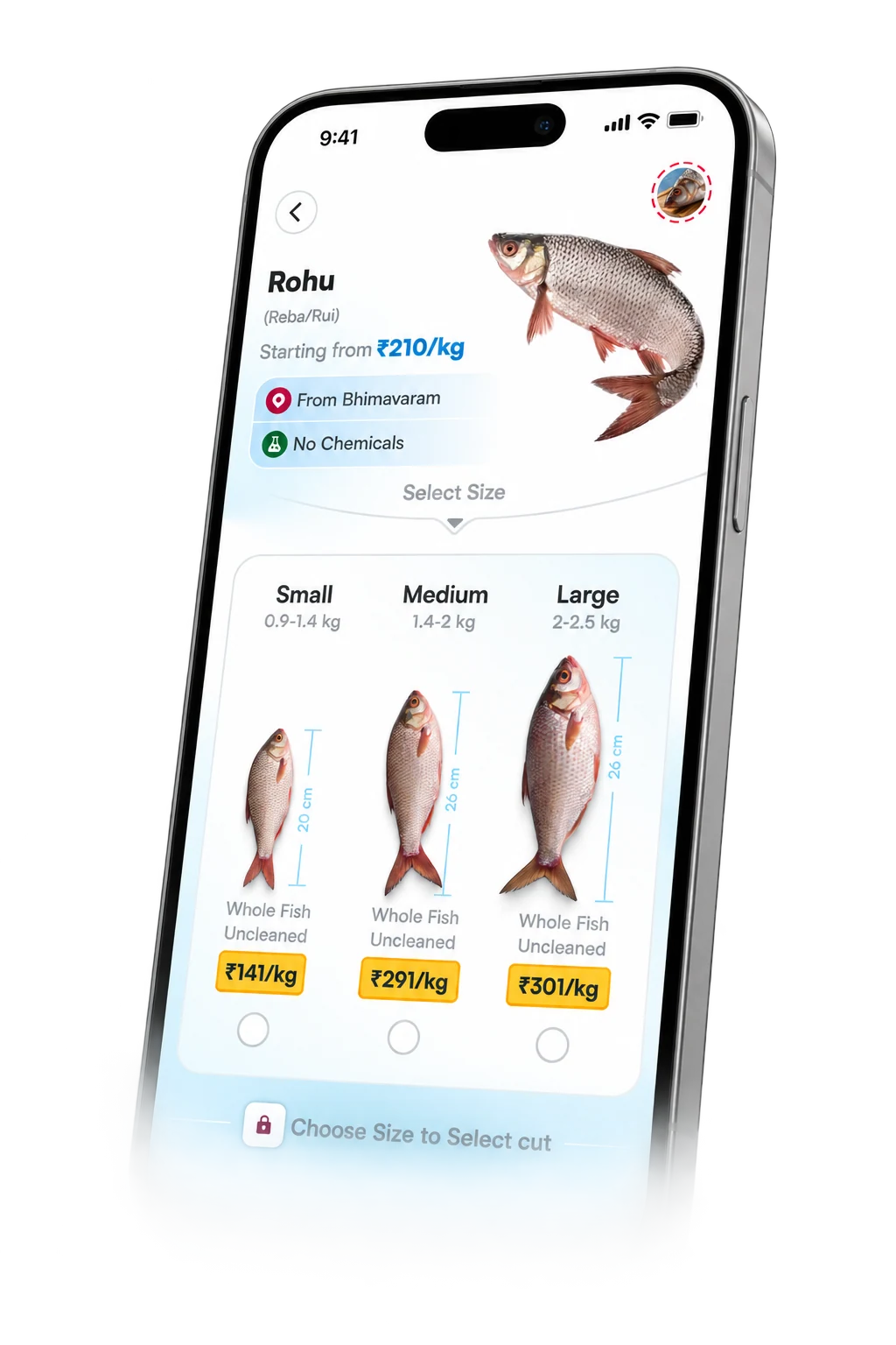
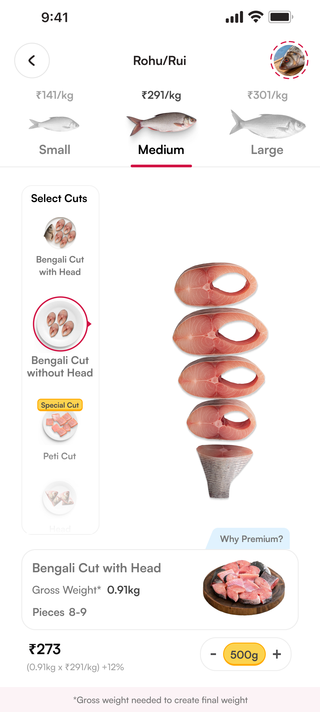
FnS 2.0 Rohu size selection in a phone mockup
the fish counter,
a little closer.
My role
Product designInteraction + motion
The scope
Discovery CartThe connected buying journey
The journey
Oct AprFrom first questions to launch
Today
LiveCurrently in A/B testing

The outcome — first

The fish counter.
Now in your hands.

01 Choose your fish. Find your size.
02 Whole fish → cut → price.

a glimpse now. the whole story below.

How did we get here?

Understand.

start at the fish counter.

Understanding offline behaviour

First, understand how
people buy fish.

We talked to people about what they checked, asked for, and trusted at their local fish counter.

  1. 01Choose the fishSize. Freshness. Variety.
  2. 02Weigh it wholeGross weight. You pay here.
  3. 03Choose your cutTell the seller your preference.
  4. 04Clean & cutPreparation reduces the weight.
  5. 05Take it homeNet weight. What you receive.

Pay for the whole fish.
Take home the prepared portion.

Five gaps in confidence.

Those conversations surfaced five connected problems. Price was one part of a bigger question: can I trust what I’m choosing?

Variety
Do you have the fish I’m looking for?
Freshness
How do I know this fish is fresh?
Size
Which size works for the cut I want?
Preparation
How does my whole fish become this cut?
Value
What am I paying for, and what will I receive?

The FnS 1.0 journey

The details were there.
The connection needed work.

The weights and prices were there. Our conversations showed people still struggled to connect size, preparation and value.

01 Browse fish

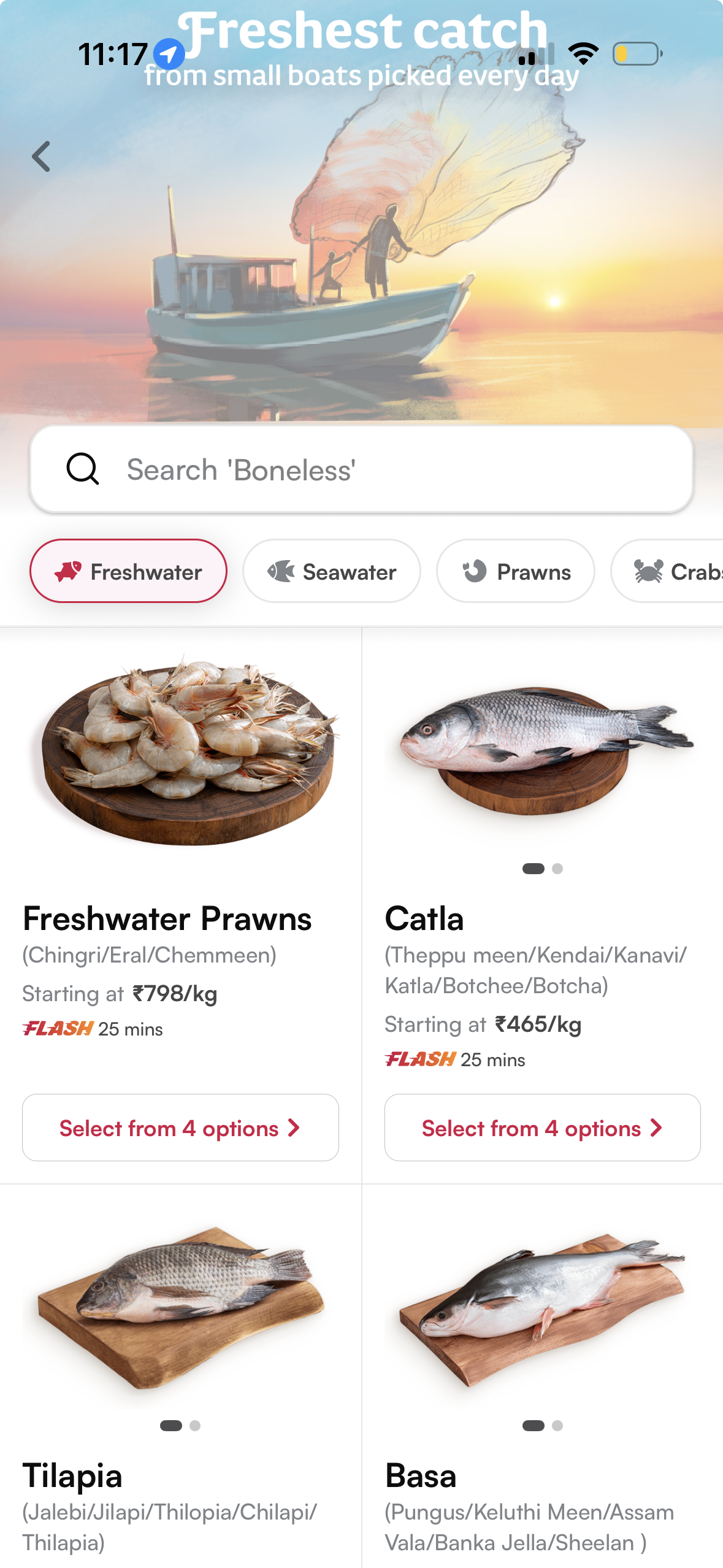
Original FnS 1.0 fish listing with freshwater categories, starting prices per kilogram and options for each fish
Options behind another step.The listing shows fish and a starting price. Size details appear on the cut-selection screen.

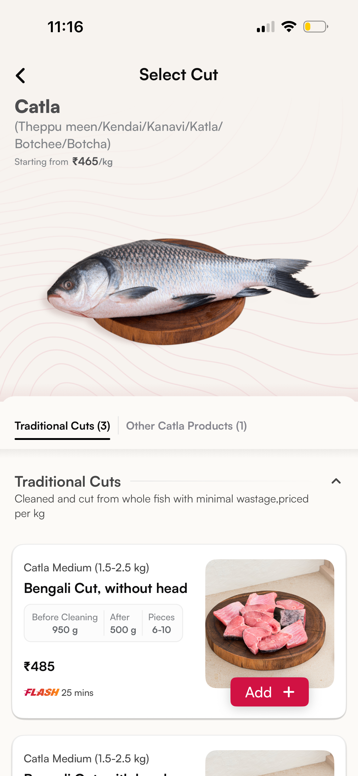
02 Select a cut

Original Catla cut-selection screen showing starting price per kilogram, medium fish size, before-cleaning 950 grams, after-cleaning 500 grams, 6 to 10 pieces and a 485 rupee pack price
The weights and price sat apart.Before/after weights sit inside the cut card, separate from the starting price per kg above.

Showing the details ≠ making them understood.

Build.

explore. test. learn. repeat.

Hypotheses to explore

How might we bring
that confidence online?

Variety
Show the range.
Freshness
Reveal the care.
Size
Make sizes comparable.
Preparation
Show the transformation.
Value
Anchor the price.

Exploring the possibilities

Explore. Question.
Start again.

We built and scrapped multiple directions. From size-and-cut cards to visual cut selectors, here’s the work before the final experience.

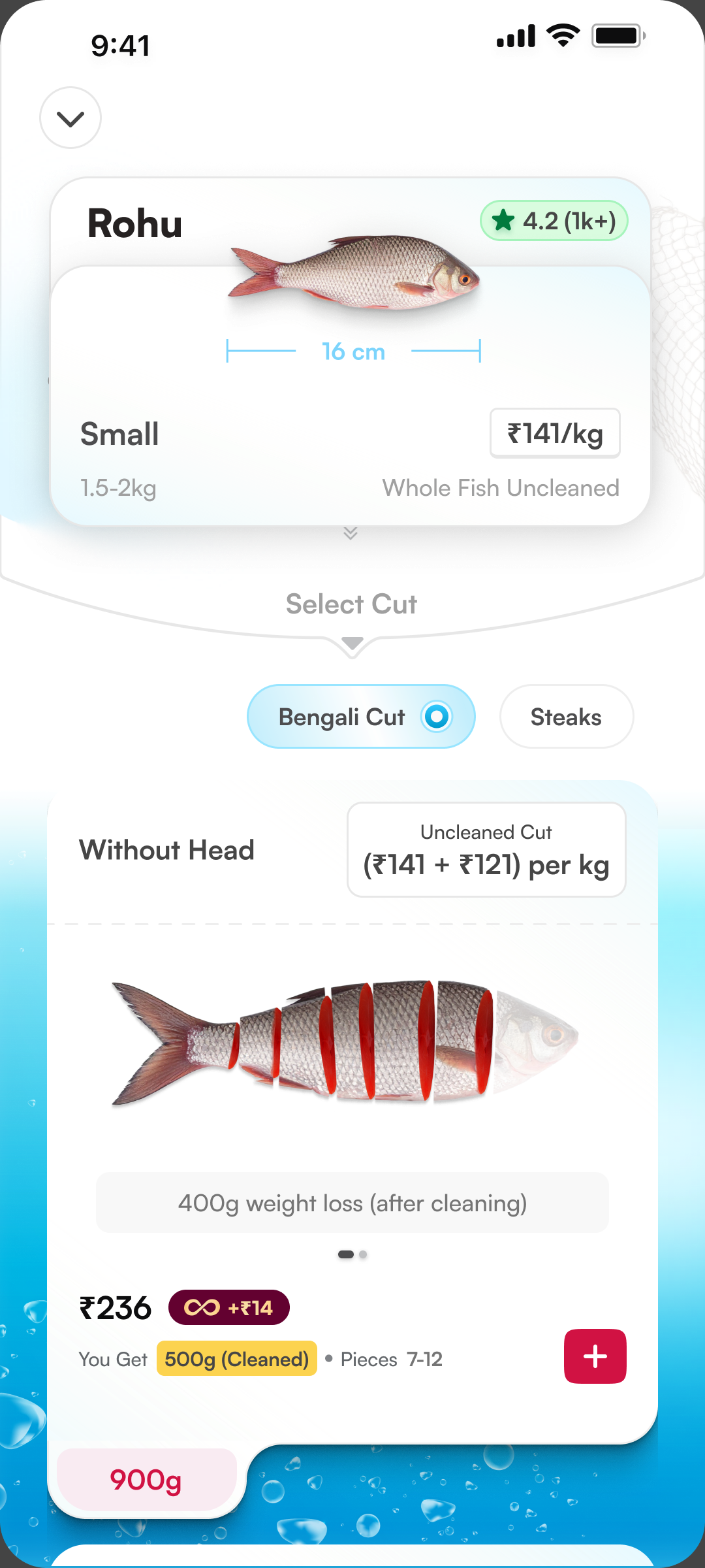
Rohu exploration with a size card, Bengali Cut and Steaks tabs, and a cut-preview card over an ocean background
Separate size & cut cardsThe size sits above a dedicated cut-preview card.
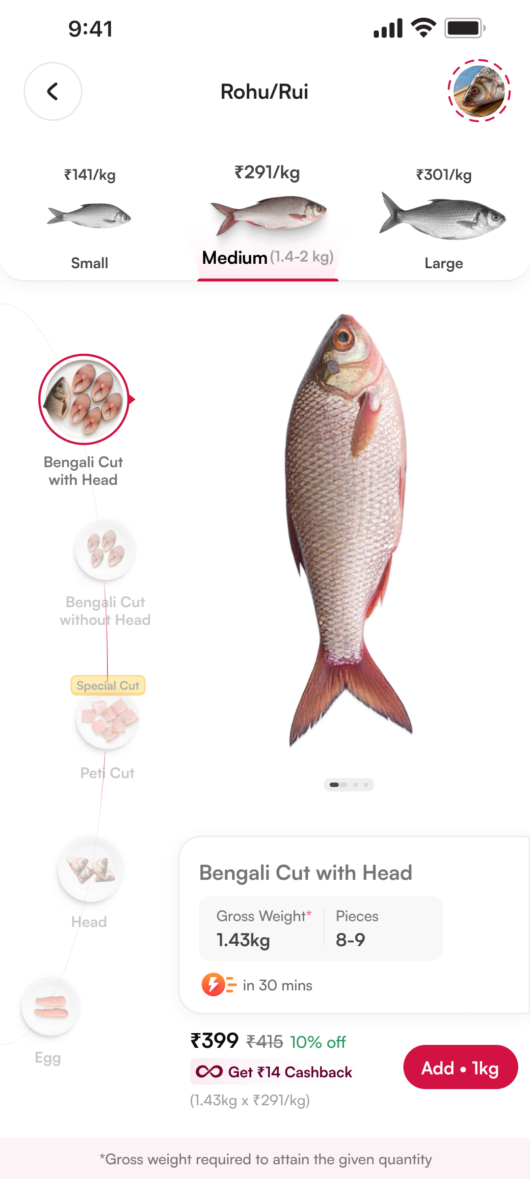
Rohu exploration with a size comparison row, curved vertical cut selector, whole fish and a compact cut summary
A persistent cut railSizes stay at the top; cuts sit beside the whole fish.
Rohu exploration with a size comparison row, vertical cut selector, separated fish steaks and a full-width weight summary
Show the piecesThe selected cut appears above a full-width weight summary.
Rohu exploration with size comparison, a vertical cut selector, separated with-head fish pieces and a compact quantity and price summary
Quantity joins the summaryThe cut stays central; quantity joins the purchase details.
the work before it worked.

The prototype

From individual choices.
To one connected journey.

We brought the decisions together in a high-fidelity prototype. Then put the old flow and the new experience in front of people.

  1. Find a fish
  2. Choose a size
  3. See the cut
  4. Understand the price
  5. Reconfirm in cart

Before launch · Prototype research

Back to people.
Not just our assumptions.

13 participants. 60-minute, in-person sessions. The old flow and the new prototype, side by side.

1213

preferred the new prototype.

Prototype preference, not business impact.
the direction connected.

What made sense

  • More variety, made visible
  • Whole fish �� selected cut
  • Sourcing and handling
  • Gross price, net portion

Preference wasn’t the whole story

They liked it.
They still missed things.

What users missed, in the screens they saw.

4

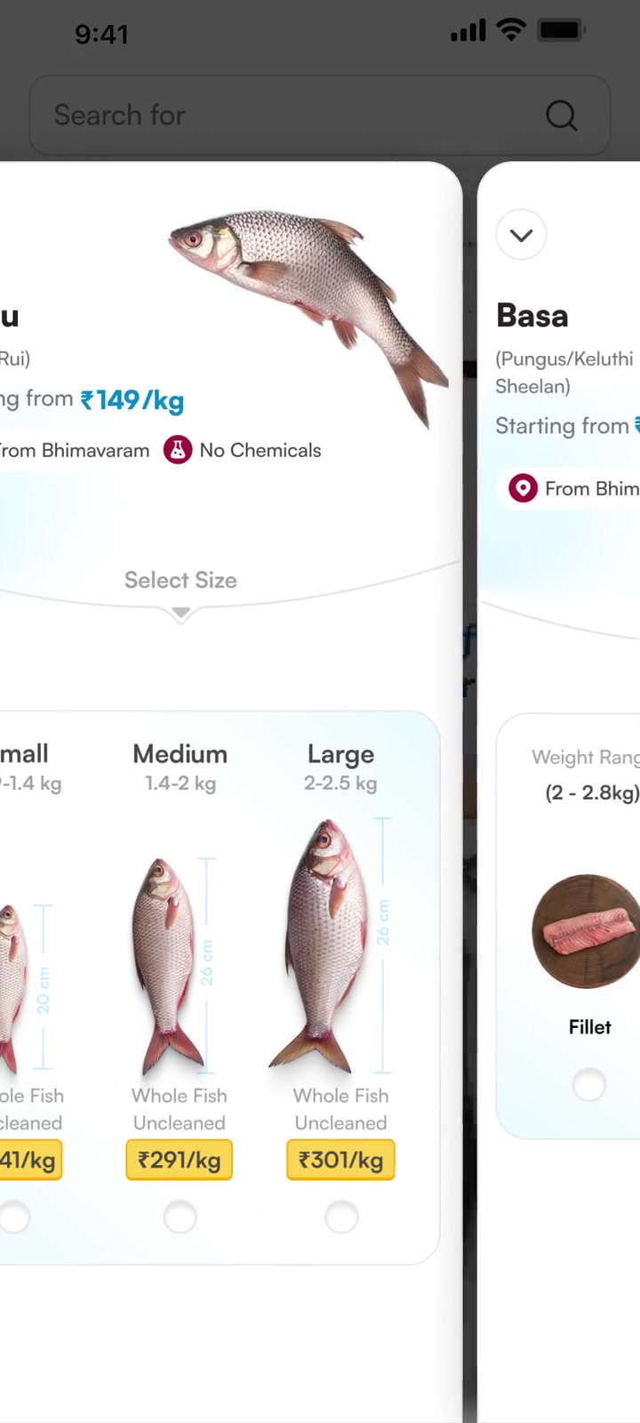
missed the swipe.

People could swipe between fish on this screen.
Four participants didn’t discover the interaction.
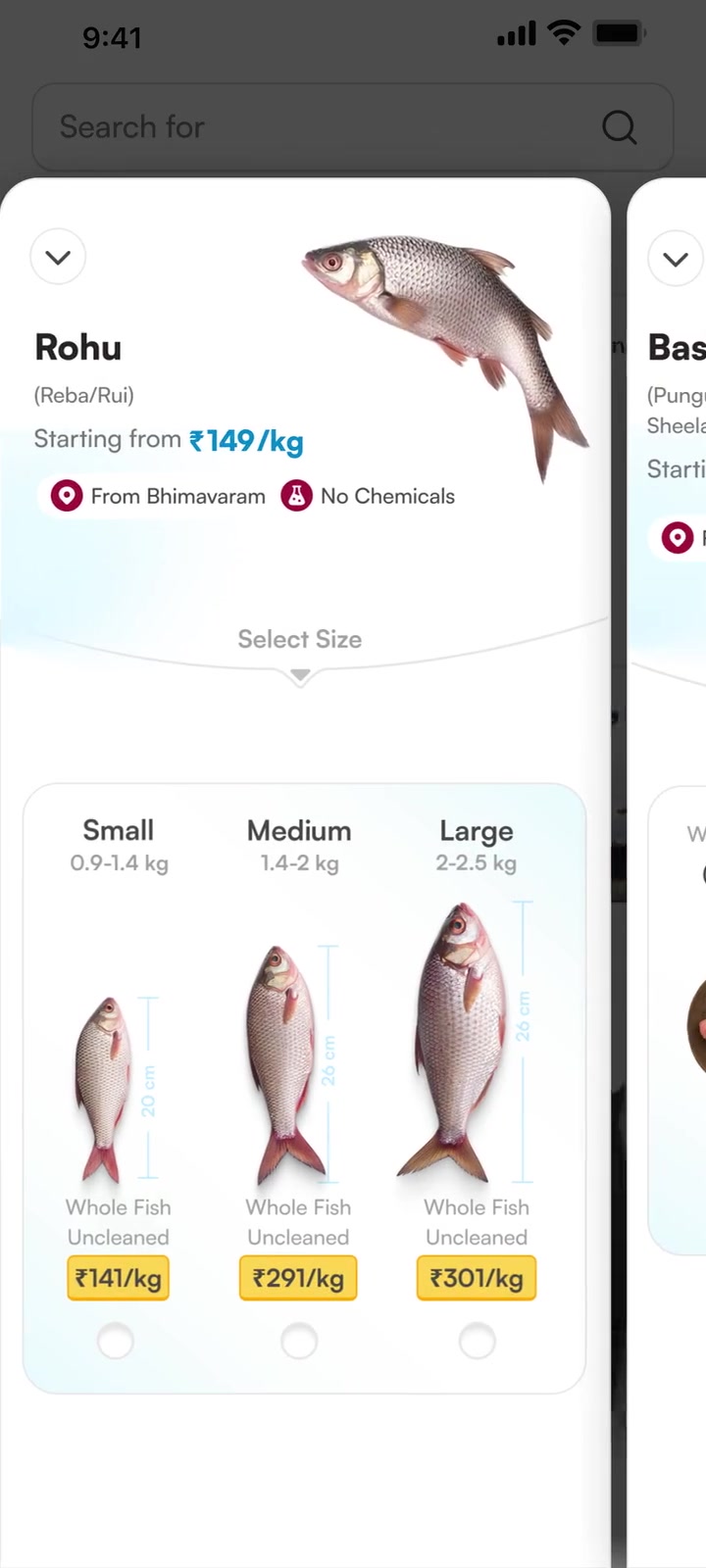
PFLP showing the Rohu fish sheet, its size options and the adjacent Basa sheet
3

read premium as GST.

The premium appeared beside the price.
Three users interpreted it as tax.
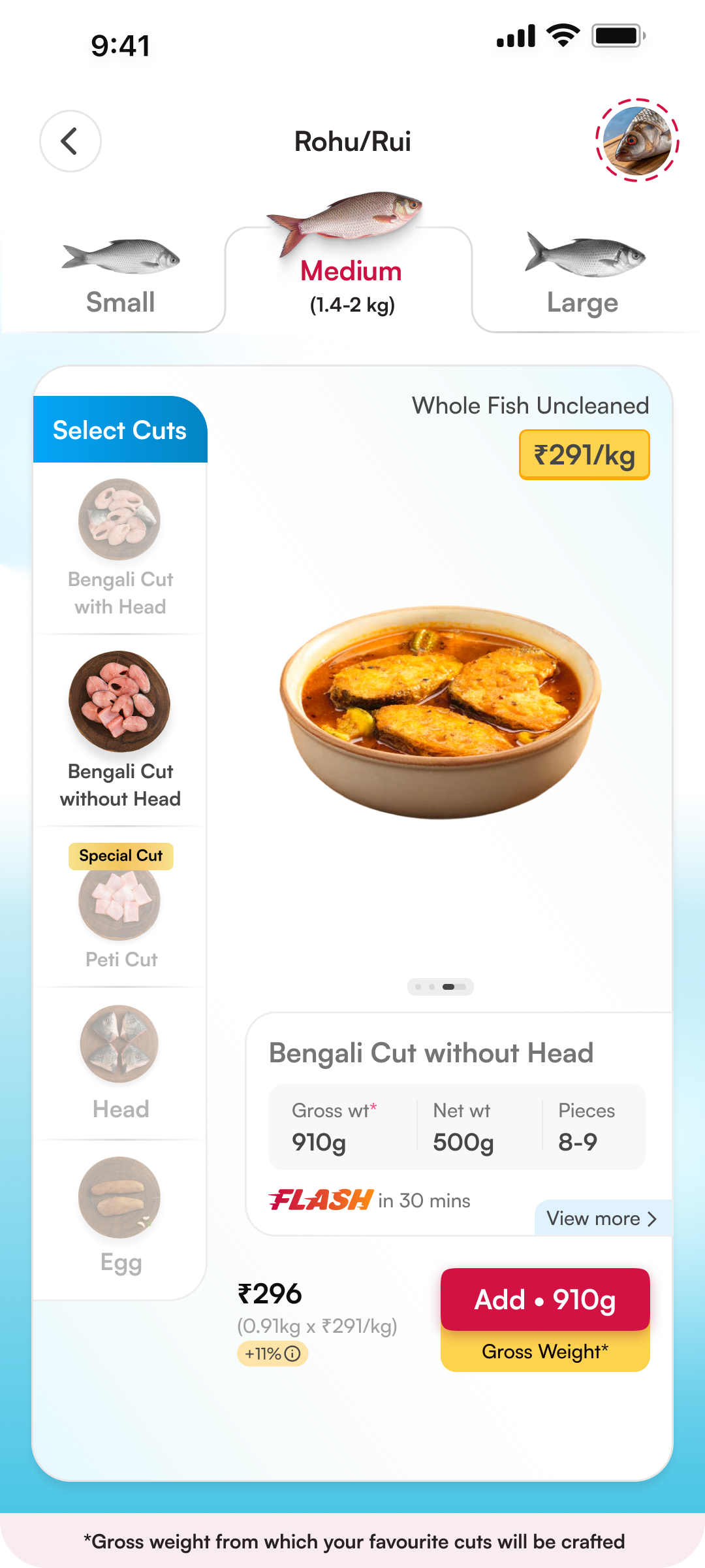
Rohu Bengali Cut without Head pricing screen with a +11% premium below ₹296 and beside the Add action

Hear it from the sessions.

The complete experience

The final FnS 2.0.

The complete journey, with the research context behind it.
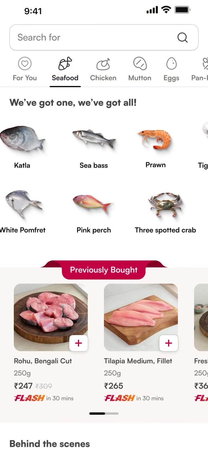
FnS category page with the variety widget
01 Discover the variety
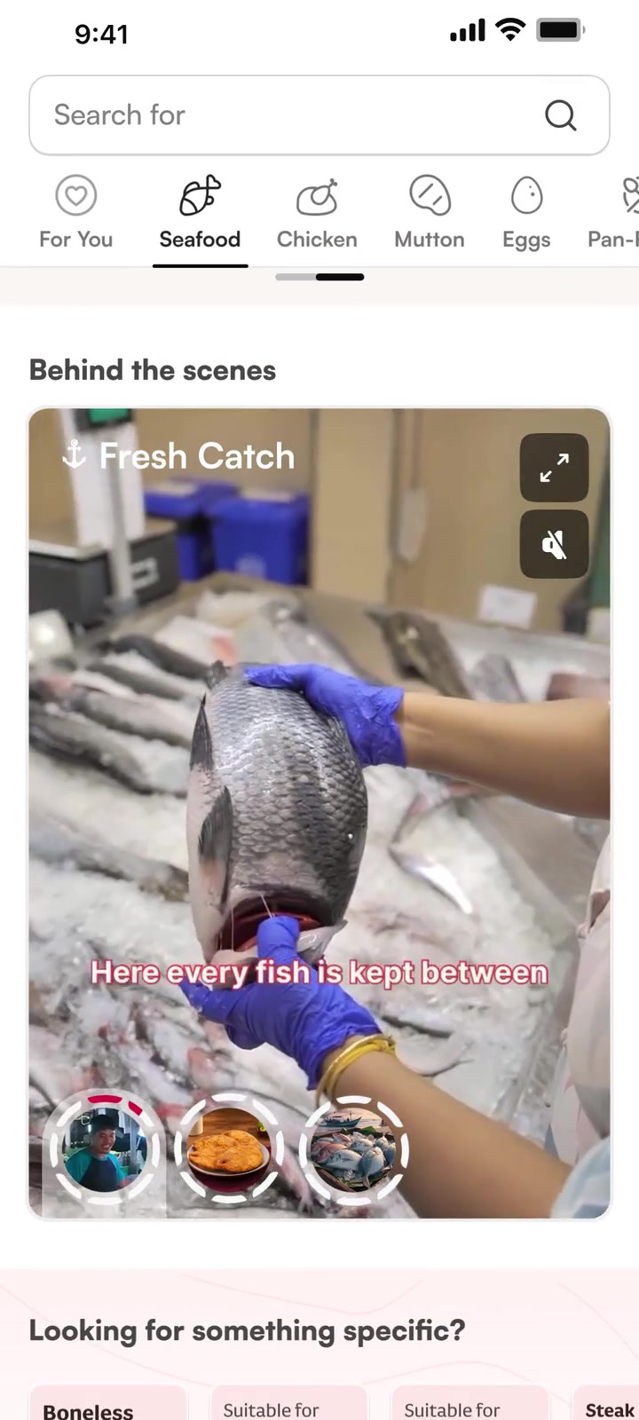
Freshness story in the category experience
02 See the process
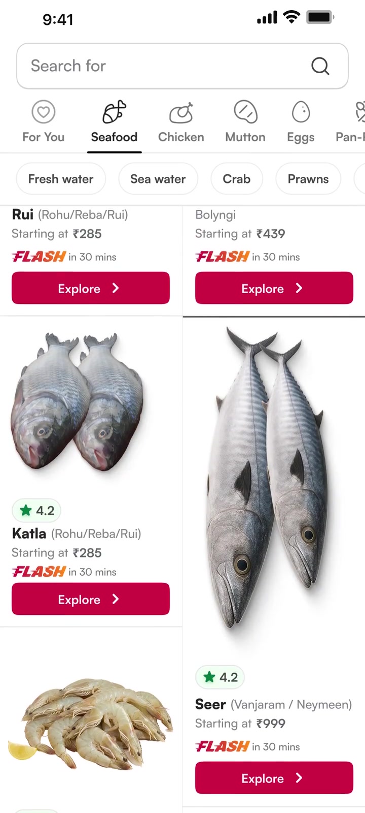
Freshwater and seawater fish listings
03 Browse your fish
Rohu and Basa sheets during the comparison swipe
04 Swipe to compare
Whole-fish sizes compared side by side
05 Choose a size
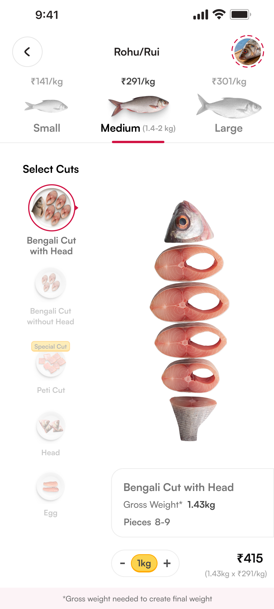
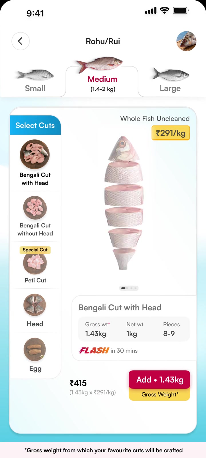
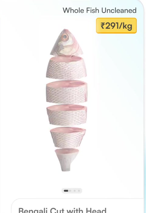
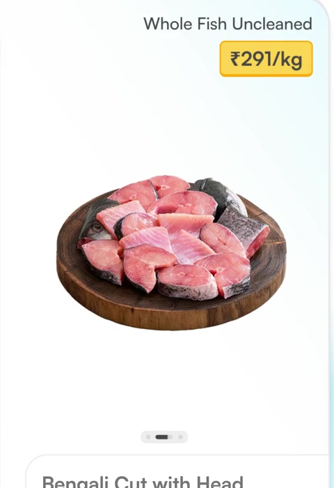
Whole-fish-to-cut transition and cut options
06 See the cut
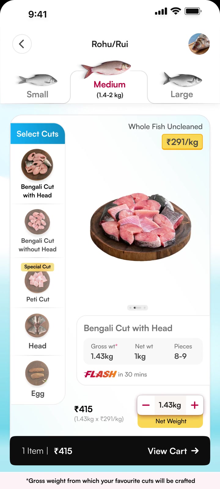
Price per kilogram with gross and net weights above Add
07 Know what you pay
Selected fish quantity and the View Cart action
08 Review your selection
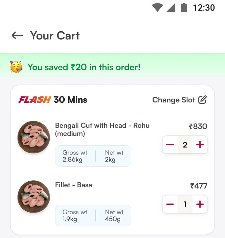
Cart with selected fish and explicit gross and net weights
09 Reconfirm in cart
all the way
to the last step.

See it in motion.

Every choice, transition and reconfirmation—in the complete original walkthrough.

Every problem.
A considered response.

Three decisions that made the familiar buying experience work online.

01 · Size & cut

Choose the whole fish.
Understand the cut.

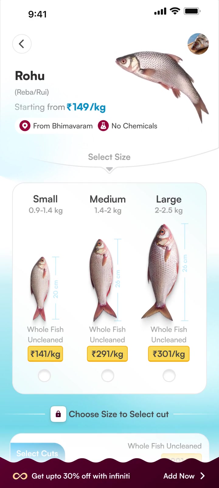
Compare physical sizes first. Then see exactly how the chosen fish becomes the cut.
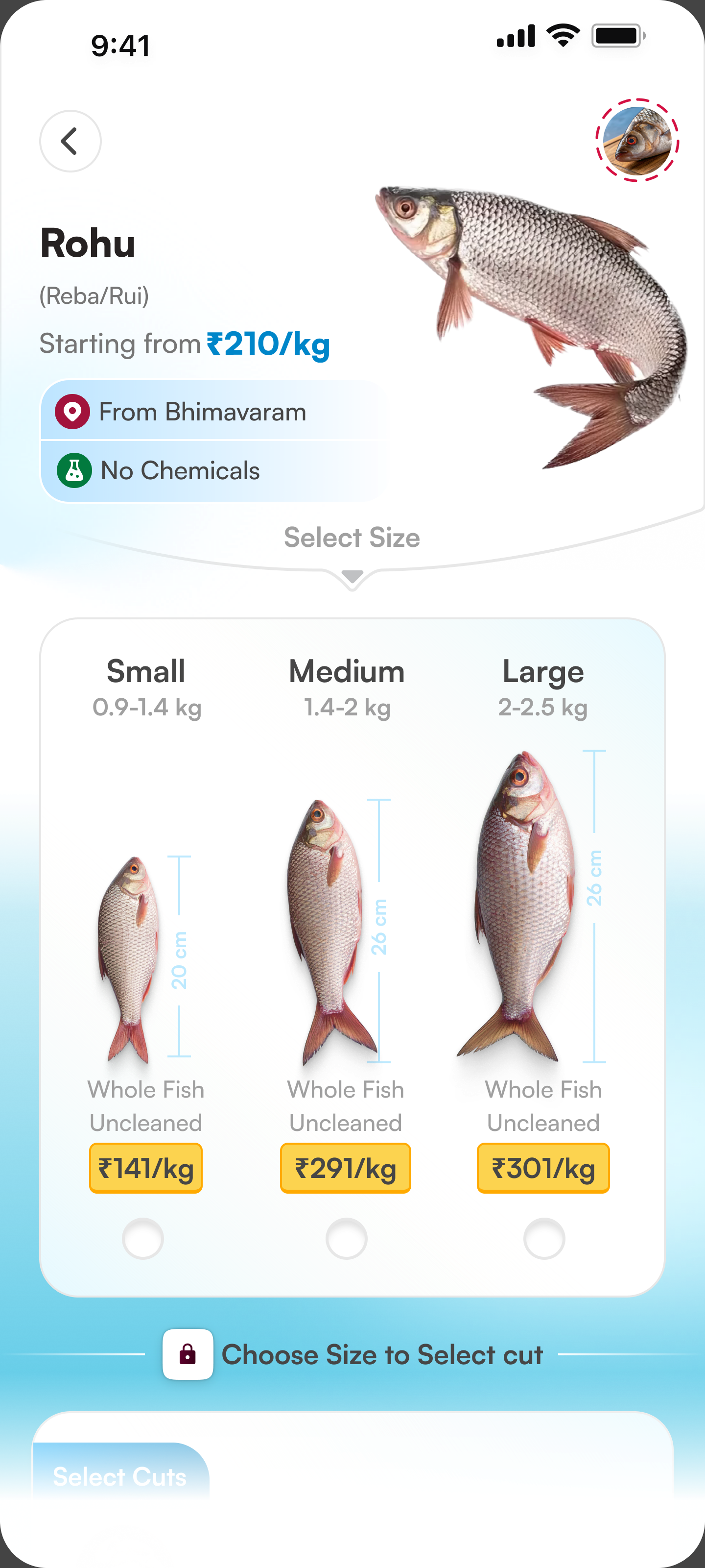
Small, medium and large fish with their weights, lengths and price per kilogram
A physical comparison.Size, weight and price together—not just S, M and L.
Motion as explanation.Lottie connects the whole fish to its pieces. The size stays in context and can still be changed.

02 · Gross, net & pricing

Same fish.
Two weights.
One clear explanation.

Anchor the price to the whole fish, then show the cleaned portion it yields.

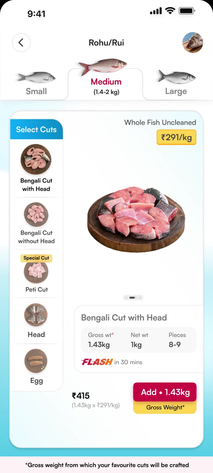
Gross weightBefore cleaning
and cutting.

The whole-fish basis for the price.

Net weightAfter preparation.

The cleaned fish that reaches the customer.
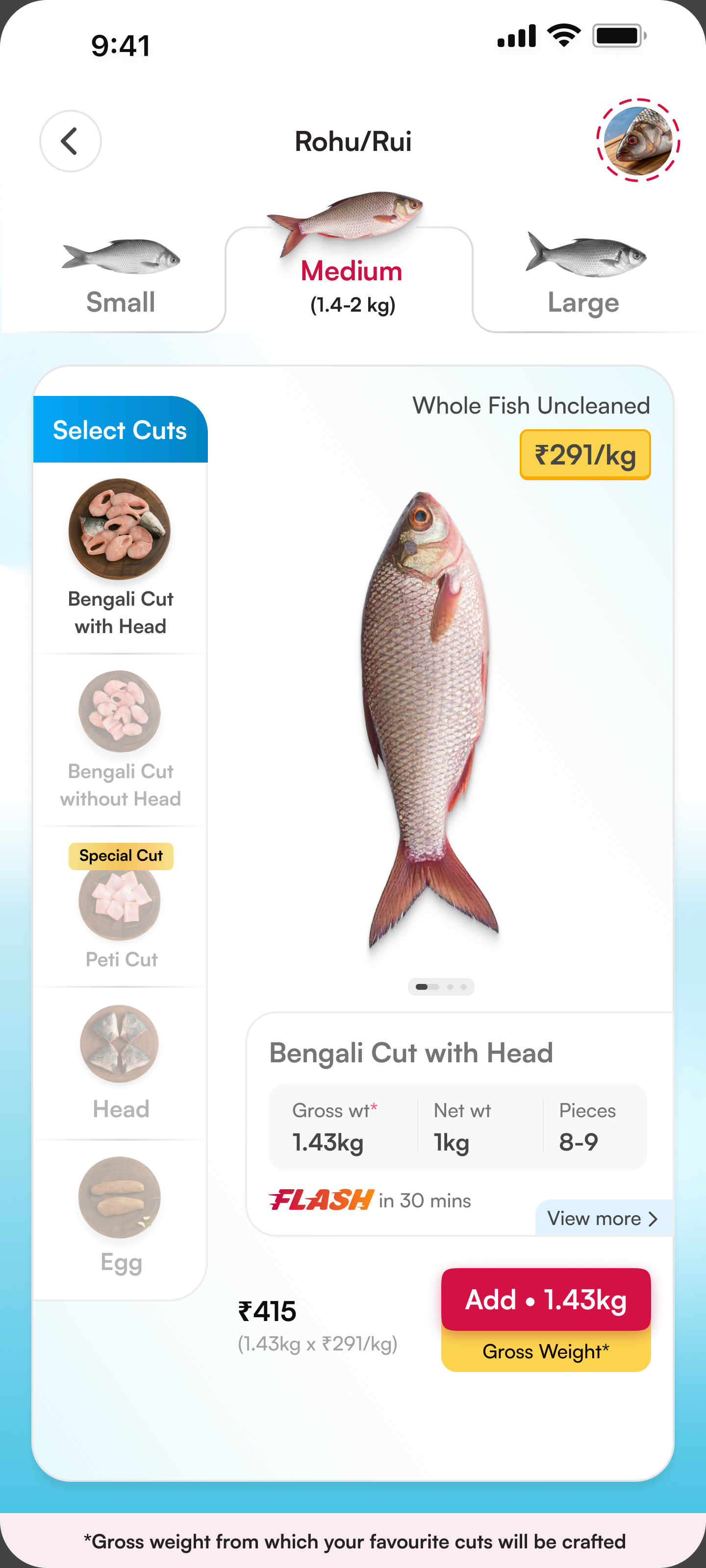
Rohu selected-cut screen showing the gross and net weight distinction and purchase details

Make what you pay for explicit.

The Add button shows gross weight beside the purchase action.
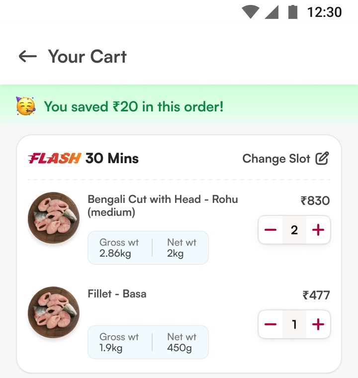
Reconfirm it in cart.

Original cart showing Rohu and Basa with separate gross and net weights

03 · Variety, freshness & trust

Show the choice.
Reveal the care.

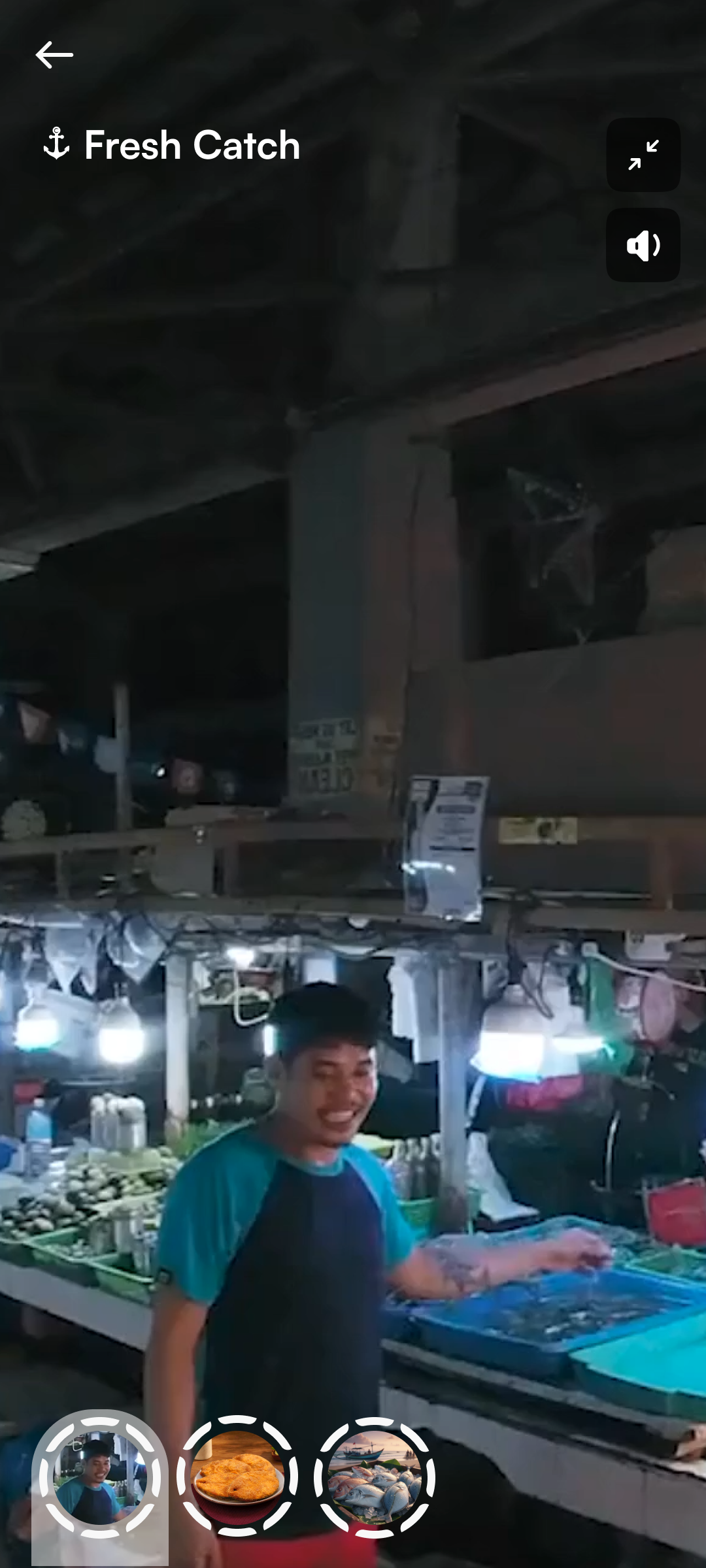
“We’ve got one, we’ve got all” made variety visible. Stories showed the sourcing and handling behind the freshness claim.
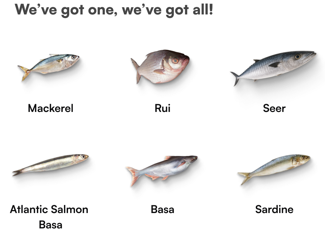
FnS variety widget presenting six fish options
choice, made visible.
Fresh Catch story explaining fish handling and care
confidence, earned.

Special cuts & premium pricing

A special cut.
A reason for the premium.

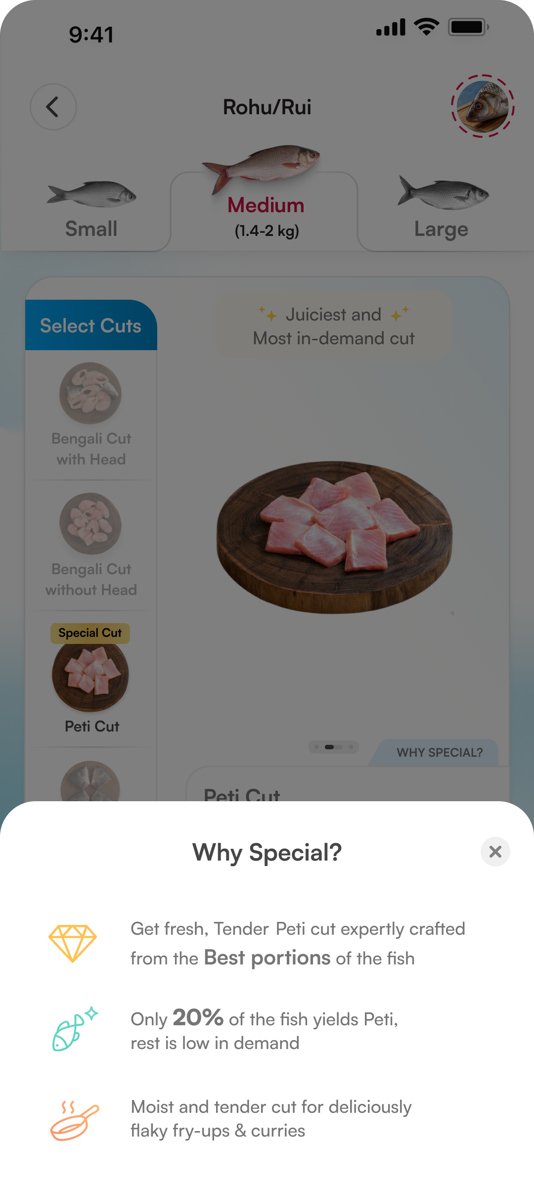
For Peti, the purchase is a selected portion—not the whole fish. Net weight makes the quantity clear. “Why Special?” explains the premium.
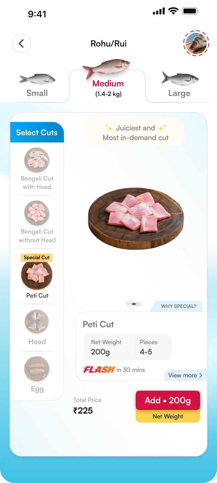
Rohu Peti marked Special Cut, with Why Special entry, 200g net weight, 4–5 pieces, ₹225 price and net weight repeated on Add
Make the portion explicit.Special Cut sets it apart. The summary shows the portion; Add repeats 200g net weight.
Why Special bottom sheet explaining Peti is selected from the best portions, stating only 20% of the fish yields Peti, and describing tender pieces for fry-ups and curries
Explain the value, in context.Selected portions. Limited yield—the design states 20%. Tenderness and cooking use. The explanation stays beside the choice.

whole-fish pricing for regular cuts. a clear net portion for special cuts.

Refined. Locked. Ready to build.

After the research sessions, we revised the screens and structure before development.

From design to development

The handoff wasn’t
the finish line.

We worked with engineering on the assets, Lottie animations and transitions.

DesignMake it clear.
EngineeringMake it work.

hours, days, and a lot of figuring it out together.
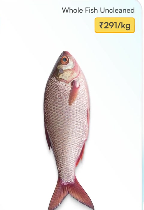
1,600+

assets to bring it to life.

one fish. so many states.
Three actual fish sizes and their measurements
Sizes & measurements
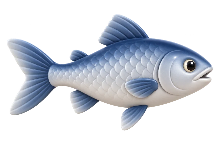
Whole fish from the actual product journey
Whole fish
Whole → pieces from the actual product journey
Whole → pieces
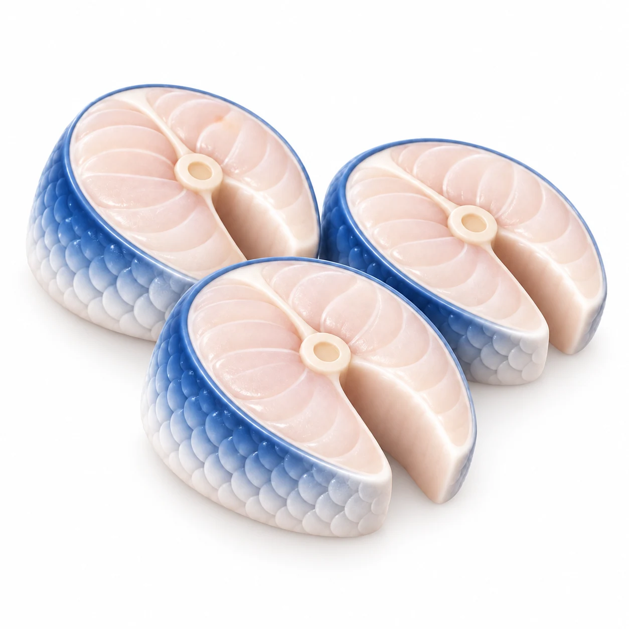
Prepared cut from the actual product journey
Prepared cut
Without-head state from the actual product journey
Without-head state
The states, in motion
October

The work began

April

FnS 2.0 launched

Learn.

the launch is a beginning.

Currently in A/B testing

Live is a beginning.

FnS 2.0 launched in April. Next comes understanding how the experience holds up in everyday use.

Post-launch · Live product metrics

What does live
behaviour tell us?

Add-to-cart rate
+8%
Purchase conversion
+5%
Weight-related queries
12%

Post-launch · The next research loop

Back to users.
Keep improving.

The next chapter: listen to real use, refine the experience, and learn again.

  1. Post-launch UXR

    Listen closely.

    Where does the live experience
    still leave people unsure?

  2. The next iteration

    Refine deliberately.

    Improve the points where
    people still get stuck.

  3. Follow-up validation

    Test again.

    Check whether the change
    actually makes things clearer.

Don’t ask people to learn a new way to buy fish. Make the familiar way work online.

Let’s connect

Good things
start with a
conversation.

Say hello
saitharunvfx@gmail.com
LinkedIn Résumé Bengaluru, India
Sai sitting cross-legged, looking up thoughtfully with a smile